Imac picked the theme for this week’s challenge. Did he say it was going to be easy? Perhaps not, maybe that is what Dave said last week. But it probably was easy for him, maybe easy for the others as well, but not for me. Make sure you go see what they came up with for “Postcard From ….”.
Often when one of the fellas, er, other challengers, mentions their idea for the theme my mind immediately picks how I want to present it, sometimes I have a scene or object in mind, sometimes I go searching.
Plenty of times my mind gets changed: I see something that would serve the theme so much better than my original thought; the target subject will not cooperate; once loaded into Photoshop my pictures for the project look like wet toilet paper and I have to switch up; or my aspirations are just too grandiose and I scale down to my abilities and equipment.
It’s what I should have done today. I should have… went out, found a picture-postcard scene, snapped a few straight up shots, a few more for good measure, cropped, edited and posted.
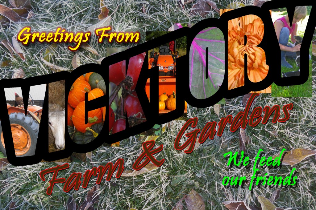
But no. I had an immediate mental image of a vintage travel postcard in my head. A fifties – sixties number, with pictures in the big block letters, with scenes that have a pin up model in them.
That was the target look. I’ve never done it before but what the heck I have, uh, had, a whole week to teach myself. So how hard could making a retro travel postcard for the Farm be, really?
Bwahahahahahah!
I thought it was going to be easy, I thought I could just make picture letters with the cookie cutter tool. Uh. No. So that began my big “how to” search.
The photoshop tutorials that got me goin’ are found at alibony.
Actually with these tutorials I found out a lot of very cool things to do, But never quite what I was looking for. They were time consuming to go through for sure, but not to awful brain breakin’.
As good as the end result from what alibony was showing me, it just wasn’t what I was lookin’ for. So back to google searching I went.
Ahhh I found it! Separate pictures in separate letters, oh dear, this fellow is using Photoshop and Illustrator, another Adobe product. So I downloaded a trial of Illustrator and was off and runnin’.
But alas, some step is missing on the written tutorial and there was no way I was gonna figure it out.
So I cobbled something out of a lot of the things I learned on alibony.
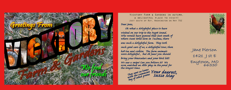
Still not the look I was shooting for. You can see some of the pictures I used to “color” the letters peaking out from the edges.
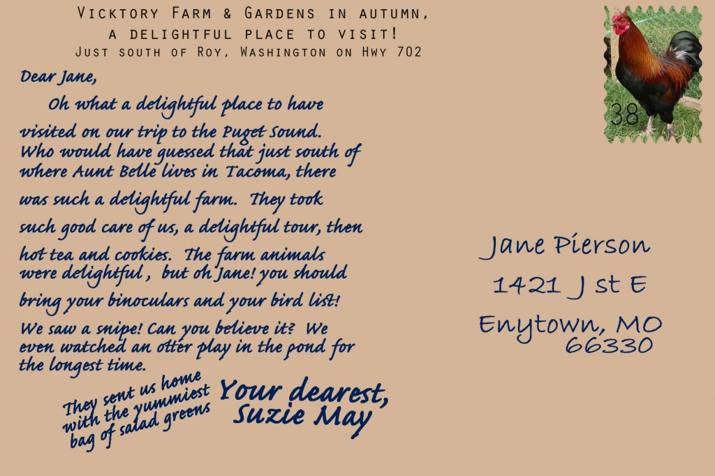
I also wanted to create a bit of a story on the back of a “postcard” to go with it. It helps fill out my header and heck… just for fun, just for you Dear Reader.
I will get this figured out, to where it looks nearly as good as my mind visions it. I’m not stopping here by any means! If I don’t get back here, have a great weekend!

Considering you didn’t really know what you were doing, you’ve done a very nice job and looks quite authentic, although I haven’t seen too many examples of this style of card before.
Looks great Mom! I like the story, it’s nice to know our customers appreciate us…….
incredible – and could you include a picture of that snipe next post????
Well Lanny, I must admit that half pint must have gone to your head,lol.
This is a great idea of yours, and it worked.
Just a tip, if you want anything to look old change the colour to sepia.
And posted before your time too.
You deserve the other half.
Fantastic postcard. If I got that postcard it would certainly make me want to visit. Well done! I can see a lot of hard work has gone in to it and it has paid off.
I think it looks great! You did a terrific job with it, Lanny. Photoshop does so many things. I only know bits and pieces of it, and I know there is a whole lot more to it.
wow you sure got it lanny! good job!
smiles, bee
xoxoxooxox
Altogether awesome results nonetheless.
Looking good..it just need to be tweaked a bit! I only know how to do a few things in Photo Shop..so I think you are doin fantastic! I will have to check out that site..you have a great weekend Lanny!
Well I think it looks pretty darn good!
It looks professional to me. I used to be able to do stuff like that with Picture It but that won’t go on a vista machine so I have your photo shop but am not smart enough to use it. (maybe I haven’t taken the time to learn would be better)
But from now on I’ll simply send my photos to you and tell you what I want done.
http://cliffmorrow.blogspot.com/2005/10/great-americans-series.html
is an example of some of my finer work.
BTW Ralph and the lovely Char will be here tonight. Char’s the reason I invite Ralph.